
Whether you are analyzing sales trends, studying test scores, or perfecting your photography exposures, visualizing raw data makes all the difference. Staring at rows of numbers can easily lead to confusion, making key patterns almost impossible to spot. That is where learning how to read a histogram becomes a massive game-changer for your analytical skills. This classic visual chart groups numerical data into clear continuous intervals, giving you an immediate picture of distributions, spikes, and outliers. By transforming complex datasets into easy-to-read vertical bars, you can spot critical operational trends instantly and make far smarter data-driven decisions.
Understanding the Fundamental Mechanics of Data Distribution
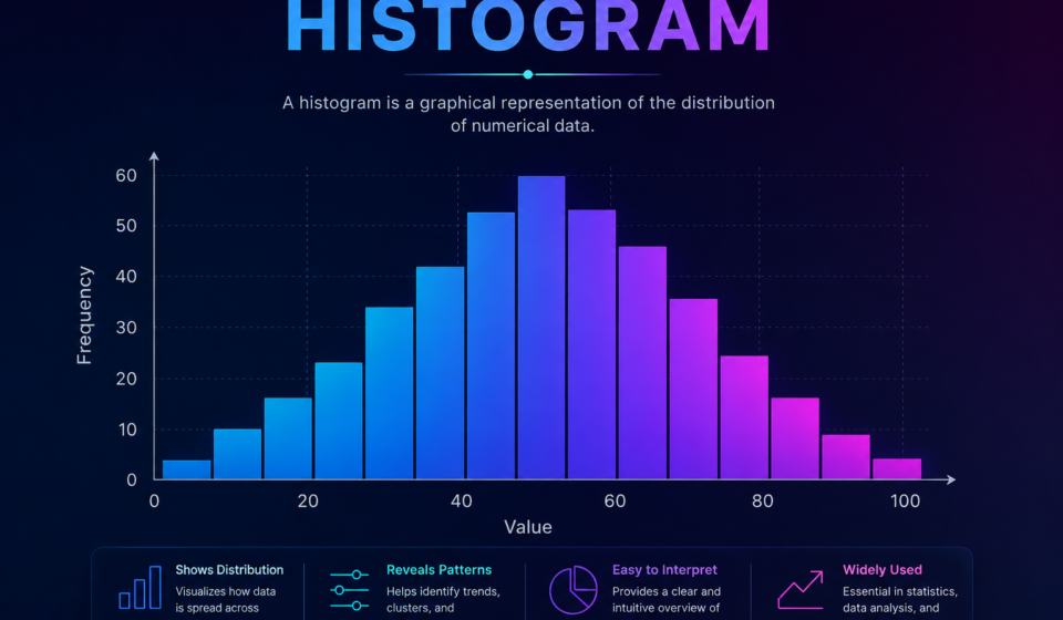
A histogram resembles a standard bar chart at first glance, but it operates on entirely different mathematical principles. Standard bar graphs compare separate discrete categories, like eye color or top-selling car brands. In contrast, this data graph measures continuous numerical variables across connected numeric ranges called bins.
Each vertical bar represents a specific numeric bin along the horizontal X-axis, while the vertical Y-axis displays the exact frequency or count. Because the underlying data flows continuously, the individual vertical bars touch each other directly without any gaps.
This continuous design reveals the true shape of your data set. You can instantly observe whether your values form a symmetrical bell curve, lean heavily toward one side, or split into multiple peaks. Understanding this overall distribution helps you predict future performance and spot hidden operational flaws before they turn into major headaches.
Core Features and Types of Distribution Shapes
Reading these charts requires recognizing common structural patterns. Spotting these visual signatures helps you evaluate performance metrics or research findings in seconds.
- Symmetrical (Normal Distribution): Features a high central peak with balanced slopes tapering off equally on both sides, resembling a classic bell curve.
- Skewed Right (Positive Skew): The highest concentration of data sits on the left side, while a long tail stretches out toward higher values on the right.
- Skewed Left (Negative Skew): Most data points cluster near the high values on the right, with a trailing tail extending toward lower numbers on the left.
- Bimodal Distribution: Displays two distinct peaks, indicating that your dataset actually contains two separate underlying groups or processes.
Practical Tips for Setting Up Optimal Bins
Choosing the right bin width is the single most important step when building your visual chart. If your bins are too wide, critical details get buried inside overly broad intervals.
Conversely, creating bins that are too narrow results in a noisy, jagged visual layout with empty gaps that mask the real trend. Start by calculating the full range of your data, then divide that range into 5 to 15 equal intervals to maintain visual clarity.
Visual Frameworks: Chart Selection Guide
Picking the correct visual layout depends on the exact type of data you want to display and analyze.
| Chart Type | Data Type Handled | Key Visual Distinction | Best Practical Application |
| Histogram | Continuous numerical data | Bars touch directly without spaces | Analyzing distribution shapes and frequencies |
| Bar Chart | Categorical or discrete data | Distinct gaps exist between bars | Comparing individual groups or items |
| Line Graph | Continuous time-series data | Points connected by continuous lines | Tracking trends over fixed time periods |
| Box Plot | Summary statistical data | Displays median, quartiles, and outliers | Quick statistical comparisons between sets |
Practical Takeaways and Future Data Trends
Integrating a histogram into your daily analytical workflow turns overwhelming streams of raw metrics into clear, actionable knowledge. By visualizing how values cluster across continuous ranges, you gain an honest look at performance variations instead of relying on simple averages.
As modern analytics software advances, automated charts dynamically adjust bin sizes in real time as fresh data streams arrive. Embracing these visual techniques ensures you can spot operational shifts early, optimize processes with precision, and present clear statistical insights to stakeholders every time.
Frequently Asked Questions (FAQs)
What is the main difference between a bar chart and a histogram?
A bar chart compares discrete categories with spaces between bars, while this distribution chart displays continuous numerical data across connected intervals with no gaps.
Why do the bars touch on this type of chart?
The bars touch because the horizontal axis represents a continuous numerical scale, meaning there are no gaps between consecutive ranges or bins.
How do I choose the correct bin size for my dataset?
Choose a bin size that keeps your chart clean and easy to scan. A standard starting rule of thumb is creating between 5 and 15 equal-width intervals based on your total data range.
Can this chart show negative values?
Yes, the horizontal axis can extend into negative numbers whenever your underlying numerical dataset includes values below zero.